The Aesthetic Bar Cart: Choosing a Cohesive Color Palette
This post may contain affiliate links. Please see my disclosure policy for details.
I used to think interior design was about buying expensive things. My first attempt at a bar cart was a testament to this flawed logic.
I bought a cool shaker I saw on a blog, some funky glasses from a vintage store, and a bright red tray because it was on sale.
The result? A chaotic mess. It looked less like a curated drink station and more like the lost and found box from a particularly vibrant party.
It took me a while to realize the truth: style isn’t about what you have, but how you put it together. The most beautiful, “aesthetic” spaces you see on Pinterest aren’t just collections of random objects. They are studies in color.
Color is the silent language of design. It sets the mood, tells a story, and turns a jumble of items into a cohesive vignette.
If you’ve been struggling to make your bar cart look polished and photo-ready, the problem probably isn’t your stuff—it’s your palette. Choosing a deliberate color scheme is the single most powerful step you can take to elevate your setup from cluttered to curated.
Let’s break down how to think like a designer and build a bar cart palette that feels intentional, personal, and stunningly beautiful.
Start with a Foundation: Your Base Color
Before you get carried away with pretty glassware and fun accessories, you need an anchor. Your base color is the dominant hue that grounds your entire design. It will be the backdrop against which everything else pops.
Your base is often determined by the bar cart itself. Is it a warm, antique brass? A sleek, matte black? A rustic, dark wood? This primary material sets the initial tone.
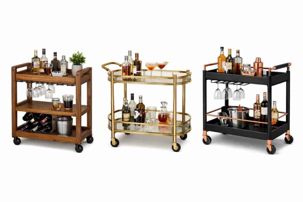
If you have a neutral cart (like chrome or glass), you have more flexibility. You can introduce your base color with a large item.
Think about a substantial wooden tray that covers most of a shelf, a set of four matching highball glasses in a deep green, or even a stack of cocktail books with spines in a similar shade. This creates a visual foundation that the rest of your items can play off of.
The Rule of Three: Your Accent Colors
Here is a simple rule that designers use constantly: stick to a palette of no more than three colors. One dominant base color, and two accents. This keeps the look intentional and prevents it from becoming visually noisy.
Your accent colors are where you bring in personality. Think about how you want the space to feel.
- For a calm, serene vibe: Pair a white or wood base with soft blues and sandy beiges.
- For a bold, energetic look: Contrast a black base with pops of vibrant emerald green and gold.
- For a warm, glamorous feel: Start with a gold base and add accents of blush pink and creamy white.

Once you have your three colors, be ruthless. If you’ve chosen a black, white, and gold palette, that bright orange bottle of Aperol isn’t invited to the party. It can live in a cabinet until it’s time to be served. The goal here is aesthetic cohesion, not displaying your entire inventory.
Popular Palettes to Inspire You
Struggling to come up with a color scheme? Don’t reinvent the wheel. Start with a tried-and-true palette that speaks to you.
Monochromatic Magic

This is the secret to a high-end, minimalist look. A monochromatic palette doesn’t mean using only one color; it means using different shades, tints, and tones of a single hue.
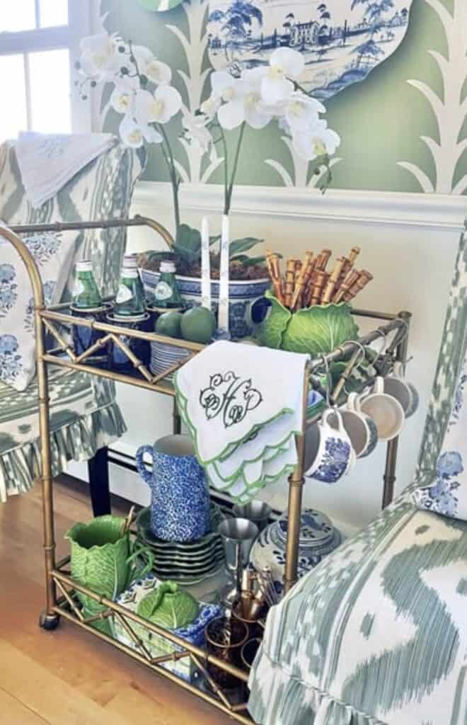
Imagine a palette built around the color green. You could have a dark forest green tray, mint-colored julep cups, and a vase of pale green eucalyptus.
The variation in shade creates depth and interest, while the single-color focus feels incredibly sophisticated and clean. This approach works beautifully with blues, grays, and even pinks.
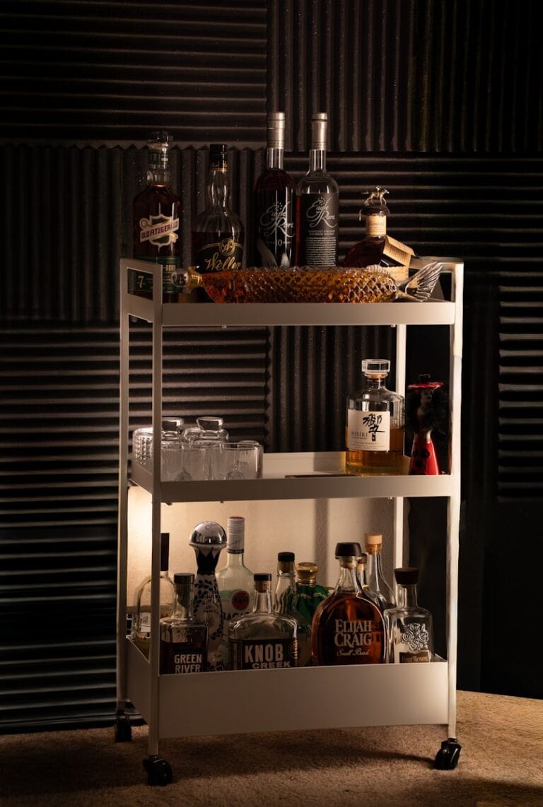
Moody & Masculine
This popular look combines dark, rich tones to create a speakeasy vibe. Start with a dark wood or matte black cart. Your base could be the deep amber of bourbon and whiskey bottles.
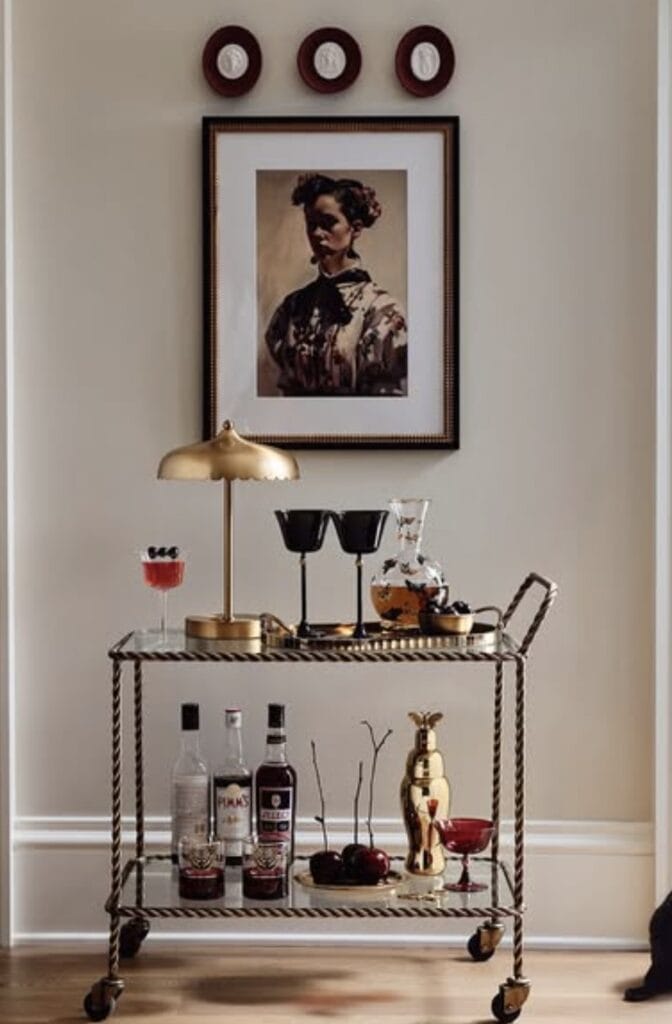
Accent this with rich leather (like coasters or a leather-wrapped shaker) and hints of burnished brass or copper in your tools. A touch of dark green, either from a plant or a bottle of gin, can complete the palette. It feels classic, warm, and serious about its cocktails.
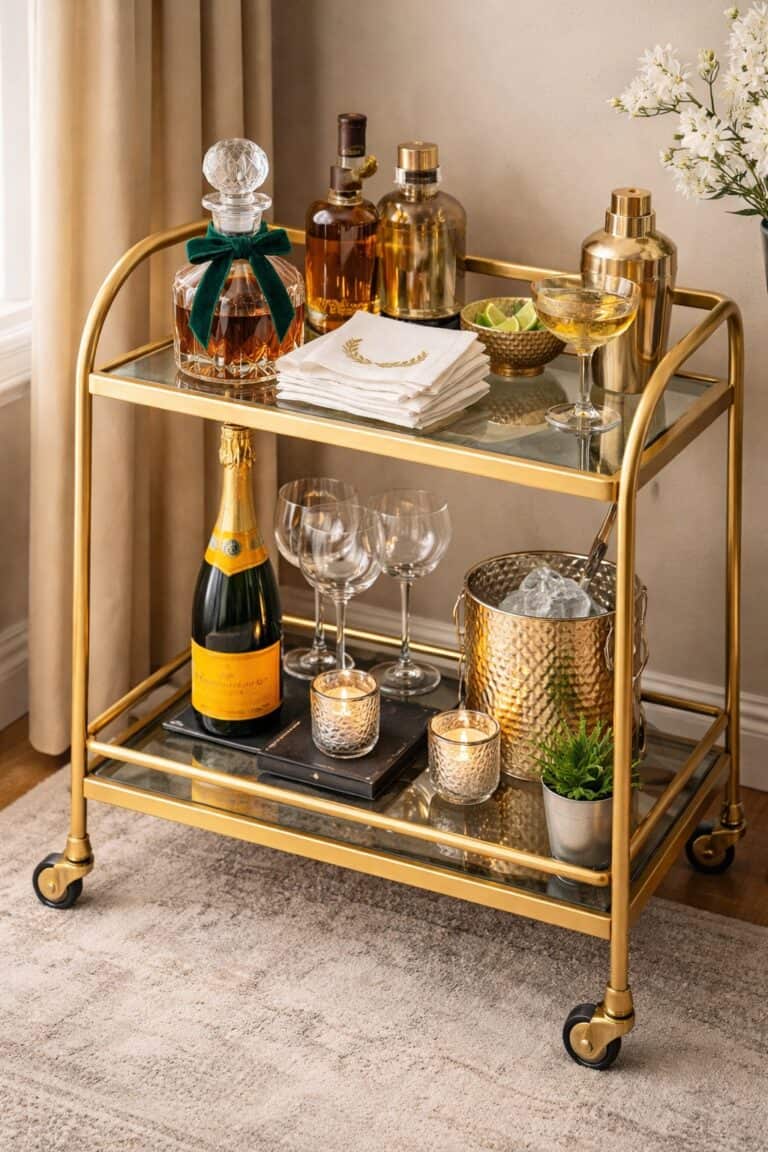
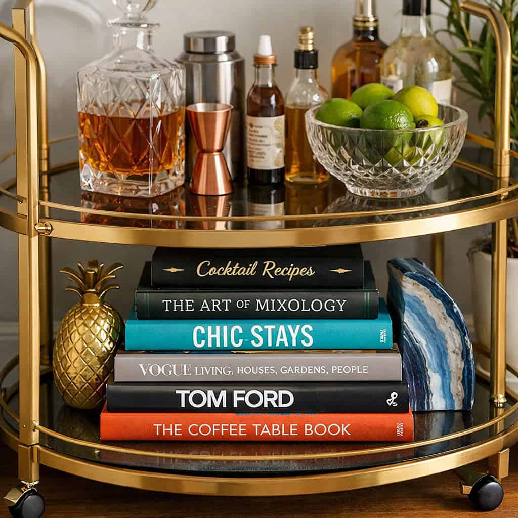
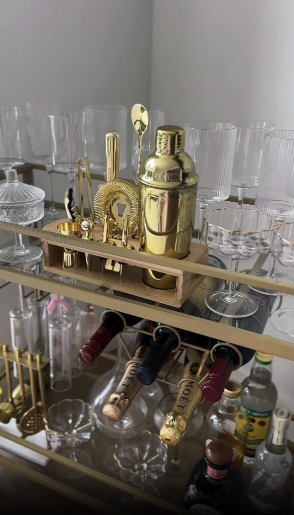
The All-Metallics Glam
For a dose of pure Hollywood glamour, forget traditional color and focus on metals. This works best when you choose one dominant metal and use another as a small accent.

A gold bar cart is the star here. Layer it with gold-rimmed glassware and a gold shaker. Then, bring in your accent. A small silver ice bucket or a set of chrome tools can add a modern edge and keep the look from becoming too yellow. The key is to let one metal dominate by a ratio of about 80/20.
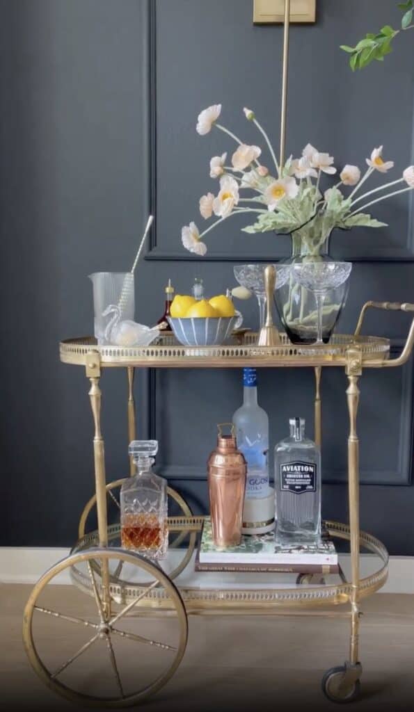
Light & Airy Neutrals
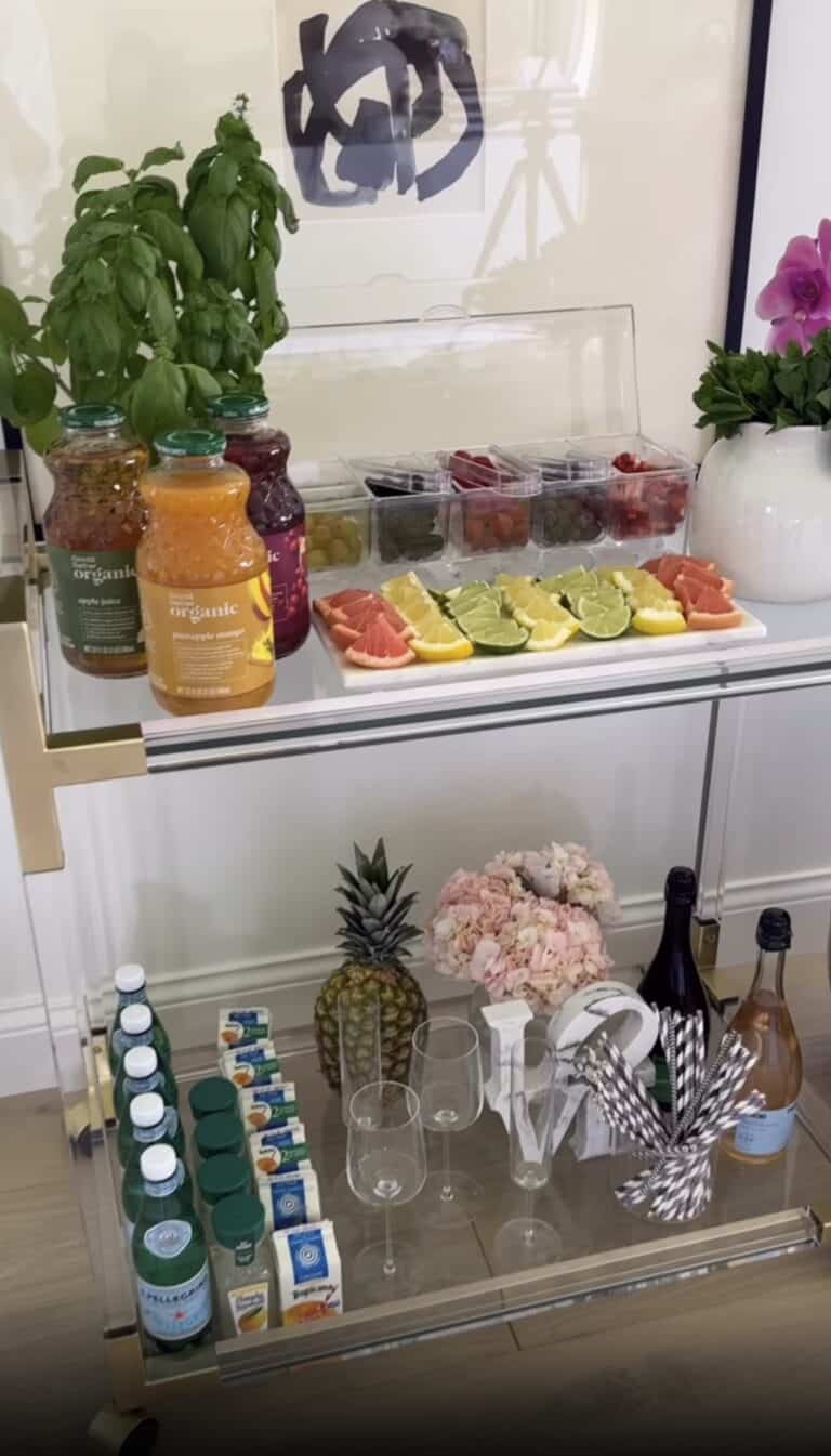
If you love a breezy, coastal, or Scandinavian aesthetic, a neutral palette is your best friend. Start with a light wood or white cart. Your palette will be a mix of whites, creams, beiges, and soft grays.
The interest here comes from texture, not color. Think fluted glassware, ceramic coasters, linen napkins, and rattan trays. The subtle variations in material create a rich, layered look that feels calming and organic.
Using Materials as Color
Remember, color isn’t just about paint. The natural materials you use are a huge part of your palette.
- Glass: Crystal and clear glass act as prisms, catching the light and adding sparkle without adding color. They provide breathing room in a dense palette. Colored glass (like amber or smoky gray) can be a great way to introduce an accent hue.
- Wood: A wooden cutting board for garnishes or a set of wooden coasters adds warmth and an organic touch. Lighter woods like beech feel Scandinavian, while darker woods like walnut feel more mid-century modern.
- Stone: A small marble slab or a set of slate coasters brings in a natural, weighty element. Marble adds a touch of luxury, while slate feels more rustic and industrial.
Integrate these materials thoughtfully. A rich walnut board will complement a moody, masculine palette perfectly, but it might clash with a light and airy pastel scheme.
Don’t Forget the Supporting Cast
Your color palette extends beyond the cart itself. The items you place on it are critical players.
- Liquor Bottles: Be selective. Some bottles are works of art (like St-Germain or Empress Gin). Others have labels that clash with your aesthetic. Decanting less attractive liquors into clear glass bottles is the ultimate cheat code for maintaining your color story.
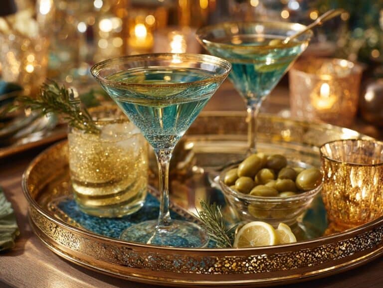
- Garnishes: Think of your garnish bowl as a rotating pop of color. A bowl of bright yellow lemons or deep red cherries can be the perfect final touch. It adds life and implies that a cocktail is imminent.
- Florals & Greenery: A small vase of flowers or a draping plant is the easiest way to lock in your accent color. If you’ve chosen a pink accent, a few pink peonies are all you need. If your accent is green, a simple sprig of rosemary does the trick.
Creating an aesthetic bar cart is a journey of curation. It’s about making deliberate choices. By focusing on a cohesive color palette, you give your design a powerful point of view. You create a corner in your home that doesn’t just hold drinks, but also tells a story about your personal style.
If you’re ready to put these color theories into practice but need a refresher on the foundational rules of arrangement and layering, our complete bar cart styling manual will guide you through the next steps.