22 Kitchen Paint Colors: Real Sherwin-Williams and Behr Shades to Try
This post may contain affiliate links. Please see my disclosure policy for details.
Picking a paint color for your kitchen sounds simple until you actually stand in the paint aisle holding a fistful of swatches. Suddenly you remember that your kitchen isn’t a blank room.
It’s full of things you can’t easily change: cabinets, countertops, flooring, a backsplash, appliances, and lighting that shifts all day long. Every one of those elements has an opinion about your paint color, whether you like it or not.
That’s exactly why so many of us freeze up. The good news? You don’t need to repaint everything or rip out your counters to fall back in love with your space. You just need the right color in the right place.
This guide walks you through real Sherwin-Williams and Behr shades, with actual names and numbers, so you can stop guessing and start narrowing things down.
We’ll cover options for walls, cabinets, islands, and accents, plus honest notes on where each one shines and where it might trip you up.
How to Choose the Right Kitchen Paint Color
Before you commit to anything, take a slow look around your kitchen. A color that looks dreamy in a photo can read completely differently in your space. Here’s what actually matters:
- Natural light vs. low light. A north-facing kitchen or one with few windows will pull colors cooler and darker. Bright, sunny rooms warm everything up.
- Cabinet color. Your paint has to live next to your cabinets, so this is a big one. Warm creamy cabinets and cool bright-white cabinets ask for different wall colors.
- Countertop undertones. Look closely. Is your granite pulling gold, gray, or pink? Your quartz? Undertones matter more than the overall color.
- Flooring undertones. Orange-toned wood, cool gray tile, and warm terracotta all change the game.
- Backsplash color. A busy or bold backsplash usually wants a calm, simple wall color to balance it out.
- Where the color is going. Walls, cabinets, an island, and trim don’t always want the same shade. A color that feels heavy on all four walls can be gorgeous on a single island.
- The mood you want. Warm and cozy? Bright and airy? Moody and dramatic? Coastal, farmhouse, classic, or modern? Name the feeling first, then shop for it.
One more thing, and I can’t say this enough: no color looks perfect in every kitchen. What follows are starting points, not promises. Test before you commit.
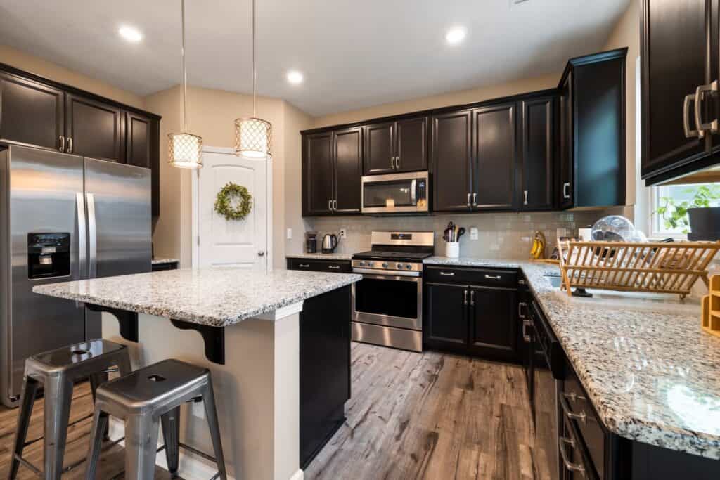
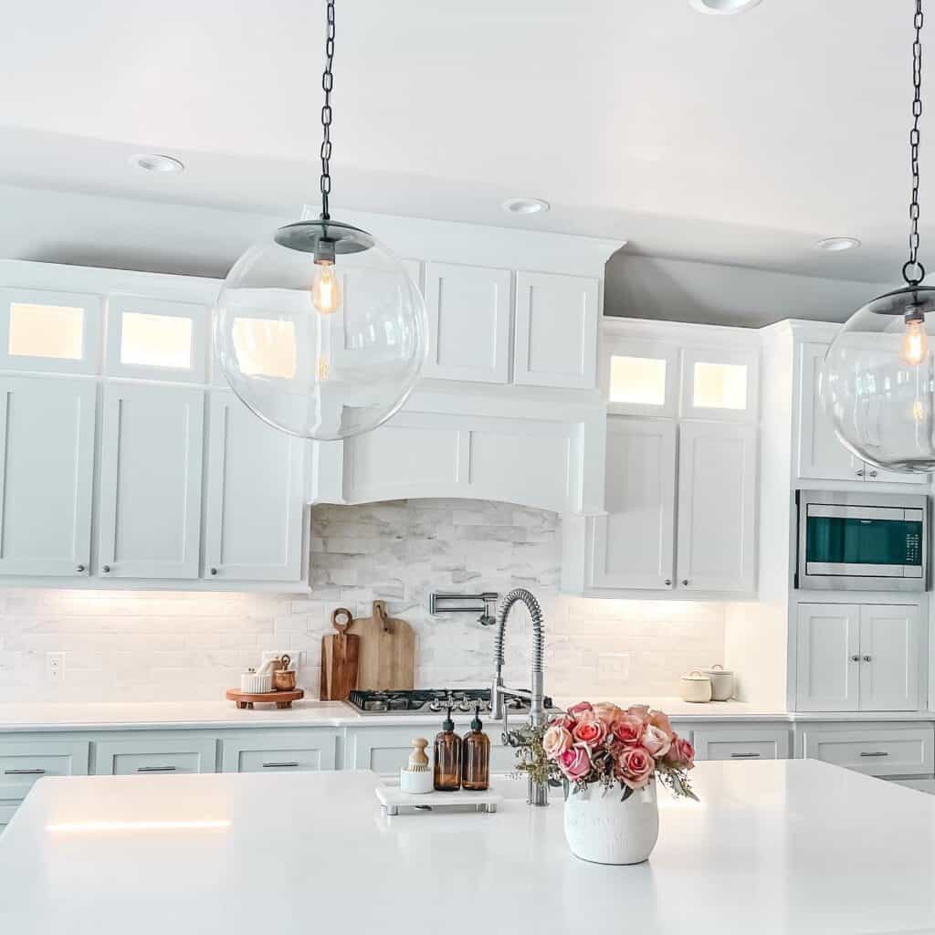
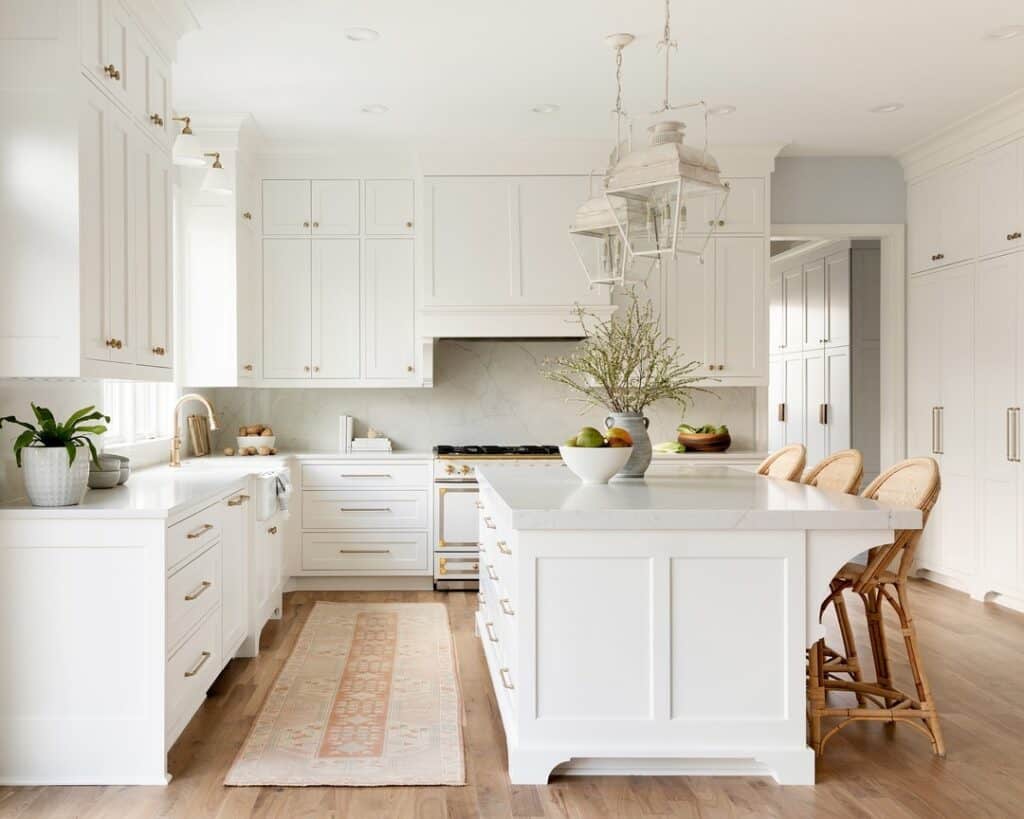
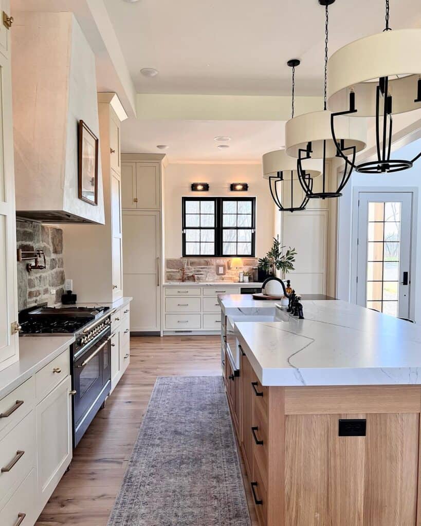
Warm White Kitchen Paint Colors
White is the most popular starting place for a reason. It feels fresh, clean, and endlessly flexible. But not all whites are created equal, and the warm ones tend to feel cozier and more livable than stark, cool whites.
Sherwin-Williams Pure White SW 7005
This is a crisp, clean white with just a whisper of warmth, so it doesn’t feel icy. It’s a workhorse for cabinets and trim, and it plays nicely with almost anything. A quick caution: next to a truly bright white, it can suddenly look softer than you expected, so compare it in place.
Sherwin-Williams Alabaster SW 7008
Alabaster is warmer and creamier, and it makes a kitchen feel soft and welcoming. It’s lovely on walls and cabinets, especially paired with wood tones, brass, and natural textures. In very low light it can lean slightly more yellow, so test it in your dimmest corner.
Behr Blank Canvas DC-003
True to its name, this is a soft, gentle white that works beautifully as a paint color for kitchen walls when you want brightness without harsh glare. It pairs well with warm woods and muted greens. Watch it against a cooler white countertop, where it may read creamier than expected.
Behr Swiss Coffee 12
A beloved, slightly warm off-white that feels timeless and cozy. It’s a favorite for cabinets, walls, and trim alike. Because it’s warm, it can feel a touch too soft next to bright white appliances, so hold a sample up before deciding.
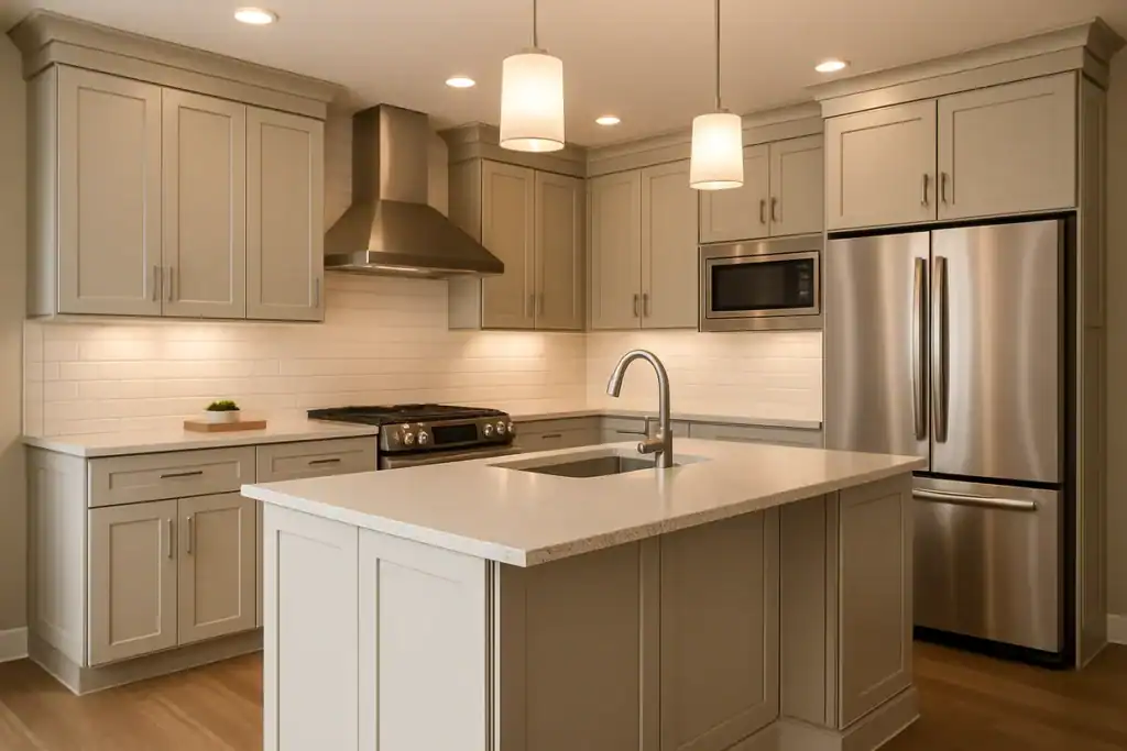
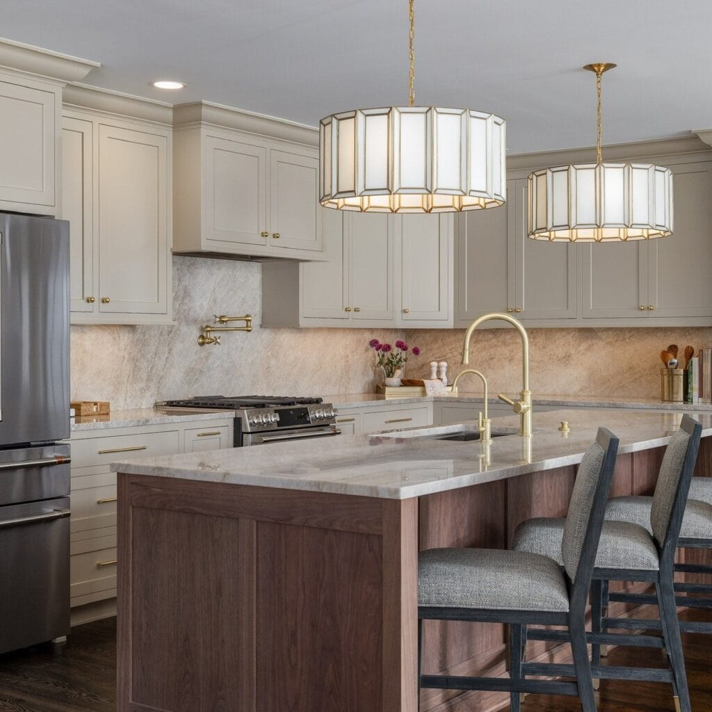
Neutral Kitchen Paint Colors
If your cabinets, counters, or backsplash already have a lot going on, a neutral wall color gives everything room to breathe. Neutral kitchen paint colors are the quiet team players that let your finishes shine.
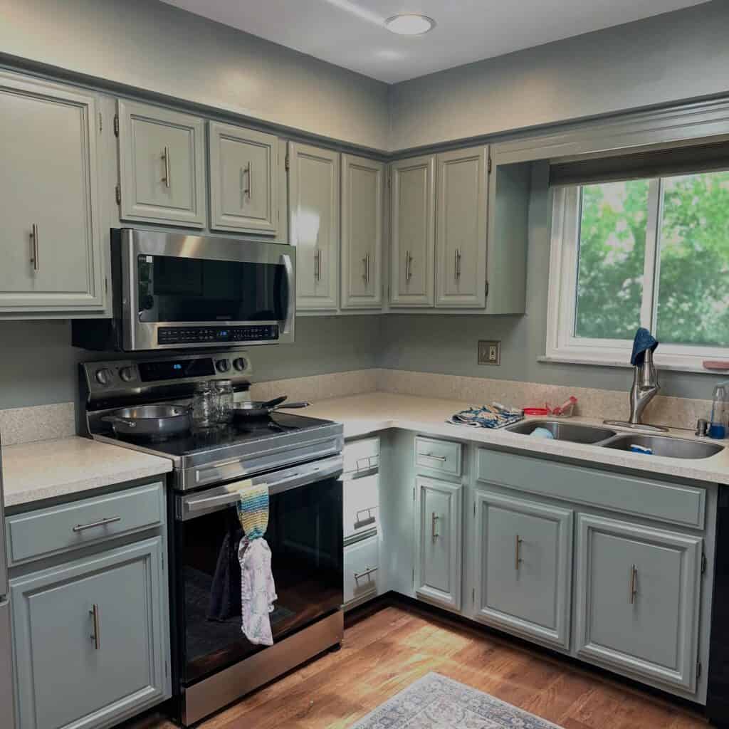
Sherwin-Williams Agreeable Gray SW 7029
This is a greige, meaning it balances gray and beige. It reads soft and updated rather than cold, which is exactly why people love it. Great for walls in kitchens with white or wood cabinets.
Sherwin-Williams Accessible Beige SW 7036
A warmer, earthier neutral that feels grounded and cozy. It’s a wonderful choice when your kitchen leans warm and you want the walls to feel soft, not flat.
Here’s the honest truth about neutrals: warm ones almost always feel more current and inviting than cool grays. If your kitchen has ever felt a little sterile, a warmer neutral can quietly fix that.
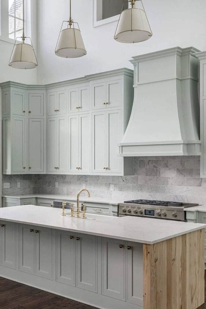
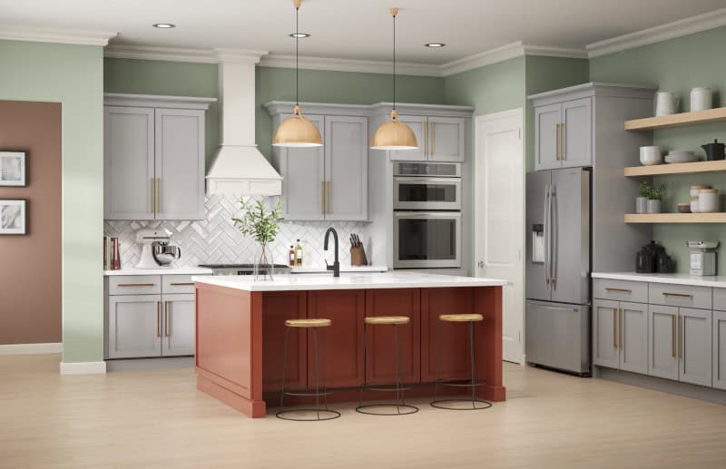
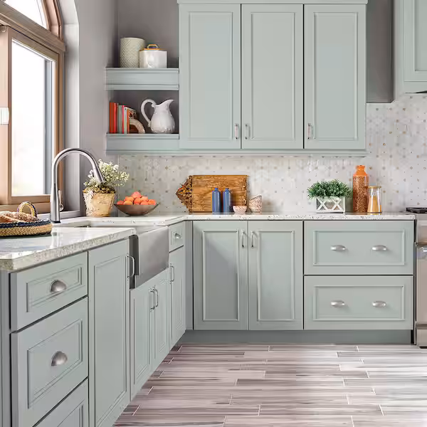
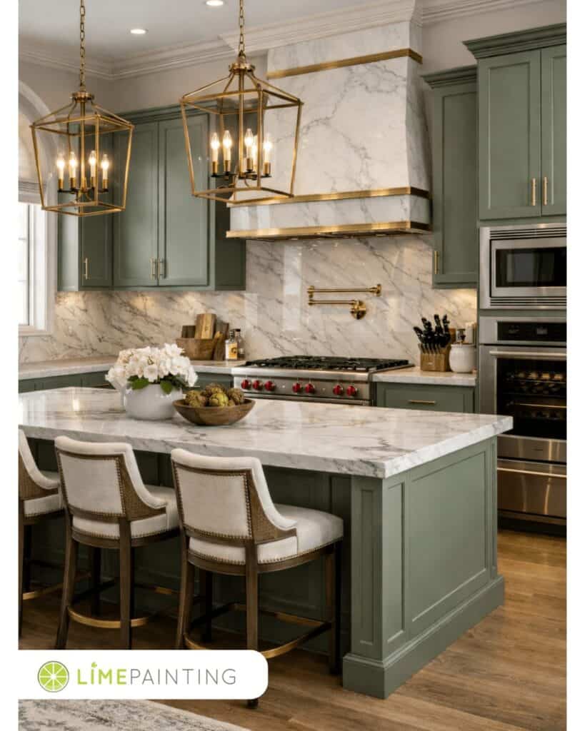
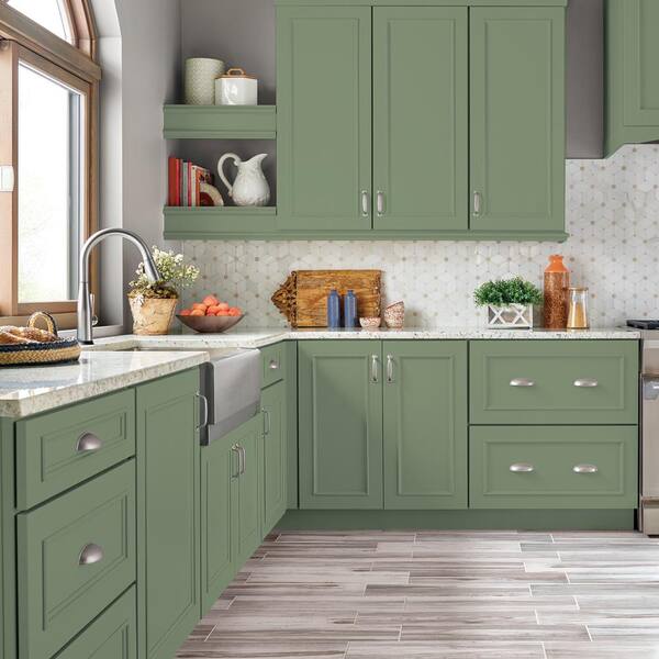
Soft Green Kitchen Paint Colors
Soft greens are having a real moment, and they earn it. Depending on the shade, green kitchen paint colors can feel calm, fresh, cottage-inspired, or gently coastal. They look especially beautiful with white cabinets, wood tones, brass hardware, butcher block counters, and natural textures.
Sherwin-Williams Sea Salt SW 6204
A soft, soothing green with hints of gray and blue. It shifts a little depending on light, sometimes reading more spa-like, sometimes more coastal. Lovely and easygoing on walls.
Sherwin-Williams Evergreen Fog SW 9130. A muted sage-gray green that feels sophisticated and calm. It works on walls and truly sings on cabinets and islands.
Behr Jojoba N390-3. A gentle, earthy green with a natural, garden-fresh feel. Pretty on kitchen walls in a cozy cottage-style space.
Behr Breezeway MQ3-21
A soft green with a coastal, airy quality that pairs beautifully with white and warm wood. Test it in different light, as it can lean more blue or more green depending on the room.
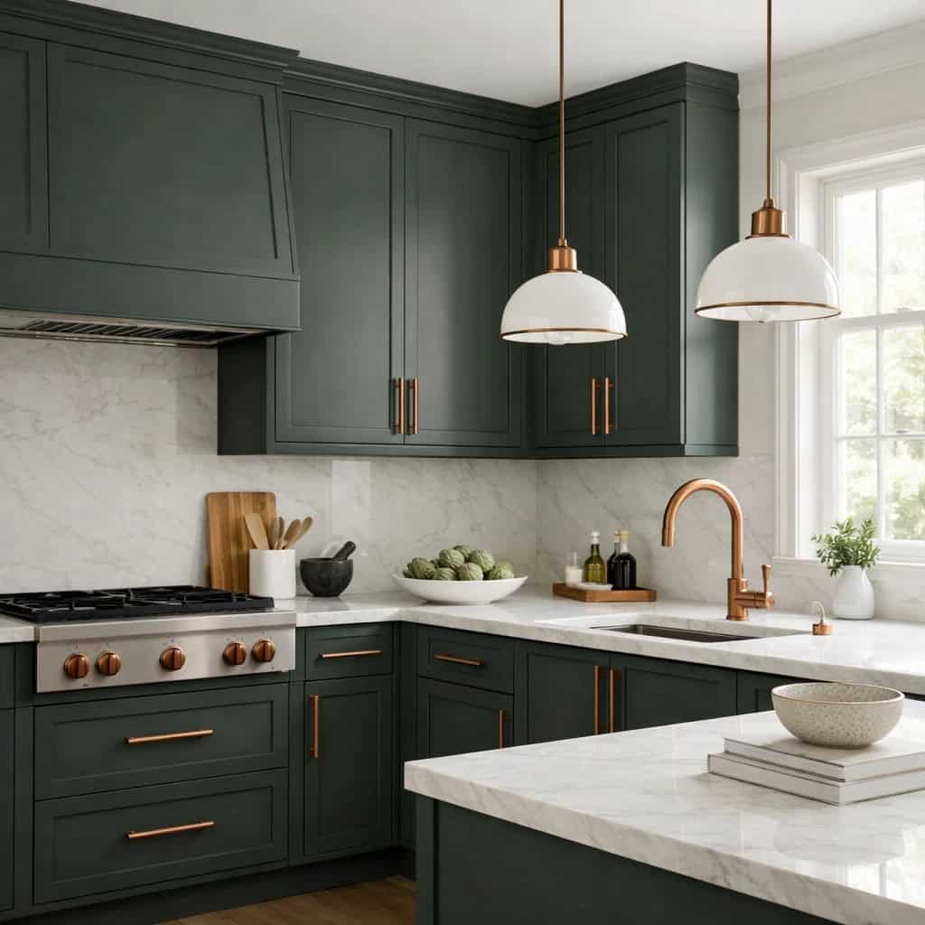
Deeper Green Kitchen Paint Colors
When you want green with more drama, the deeper shades deliver. These earthy, classic tones look especially good on kitchen cabinets, islands, lower cabinets, built-ins, or an accent area. They feel timeless and a little historic without chasing a trend.
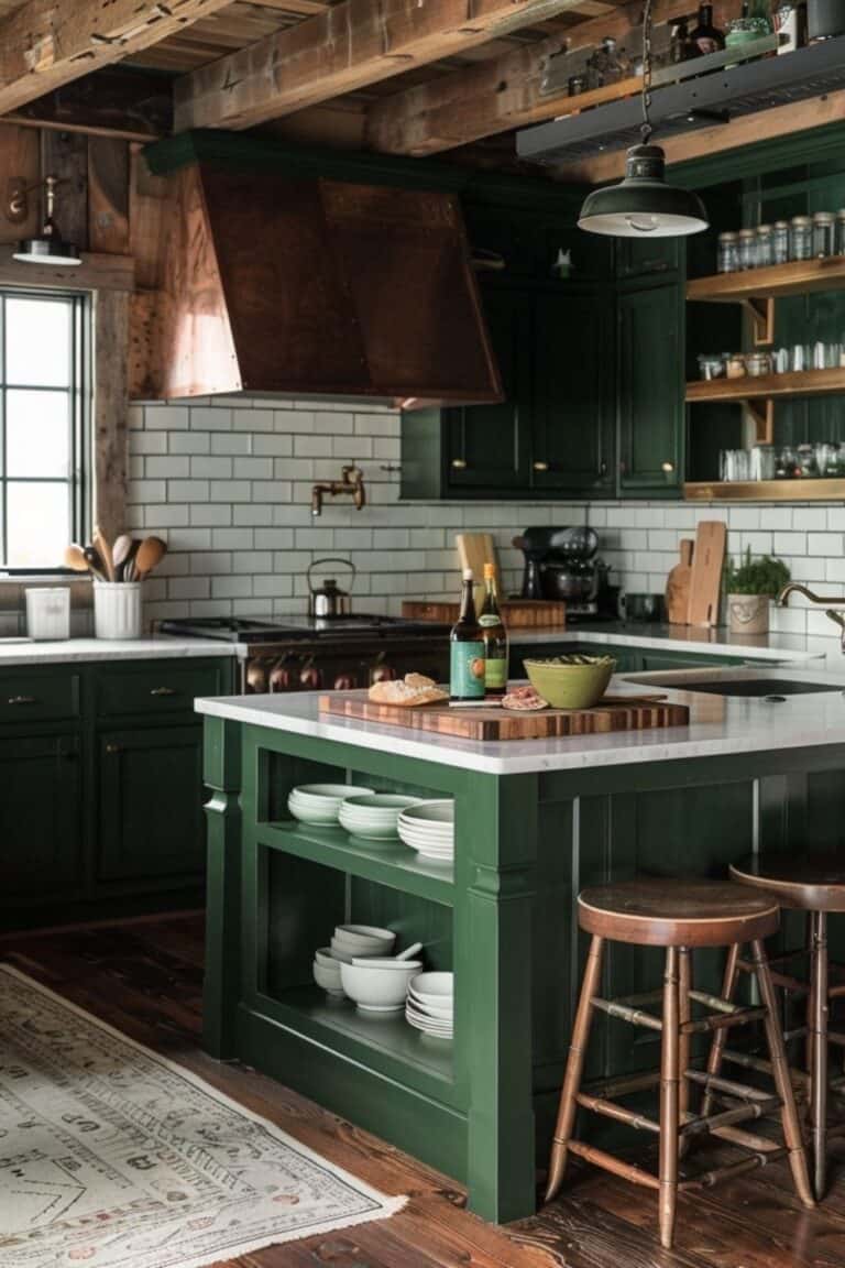
Sherwin-Williams Pewter Green SW 6208
A rich, grounded green with gray undertones. Stunning on a kitchen island or lower cabinets, paired with brass or gold and warm wood.
Sherwin-Williams Dried Thyme SW 6186
An earthy, herb-inspired green that feels warm and cozy. Beautiful on cabinetry when you want depth without going too dark.
Behr Laurel Tree S390-5
A deeper, natural green with a classic feel. Works well on islands and built-ins, especially against creamy whites.
A gentle note: deeper greens need enough light and contrast around them so they read as intentional and rich, not muddy. Balance them with lighter walls or warm metals.
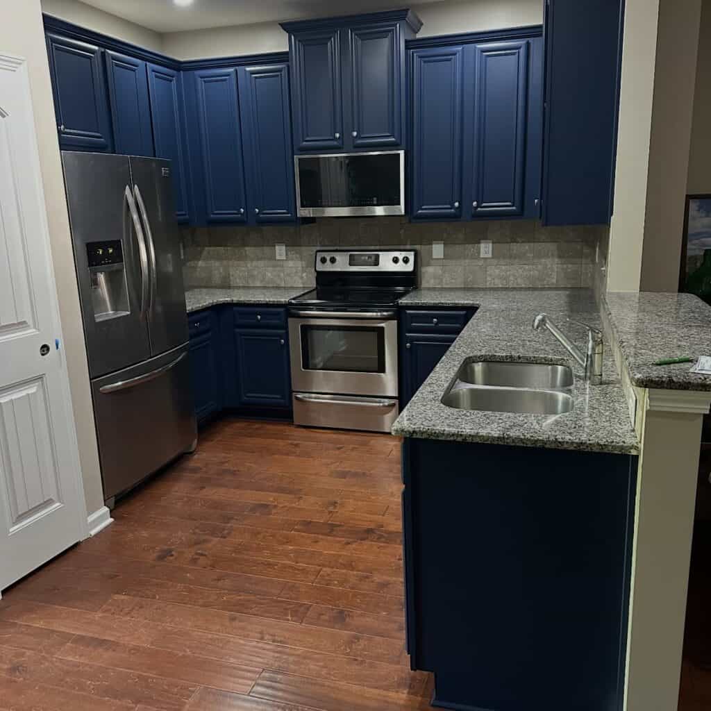
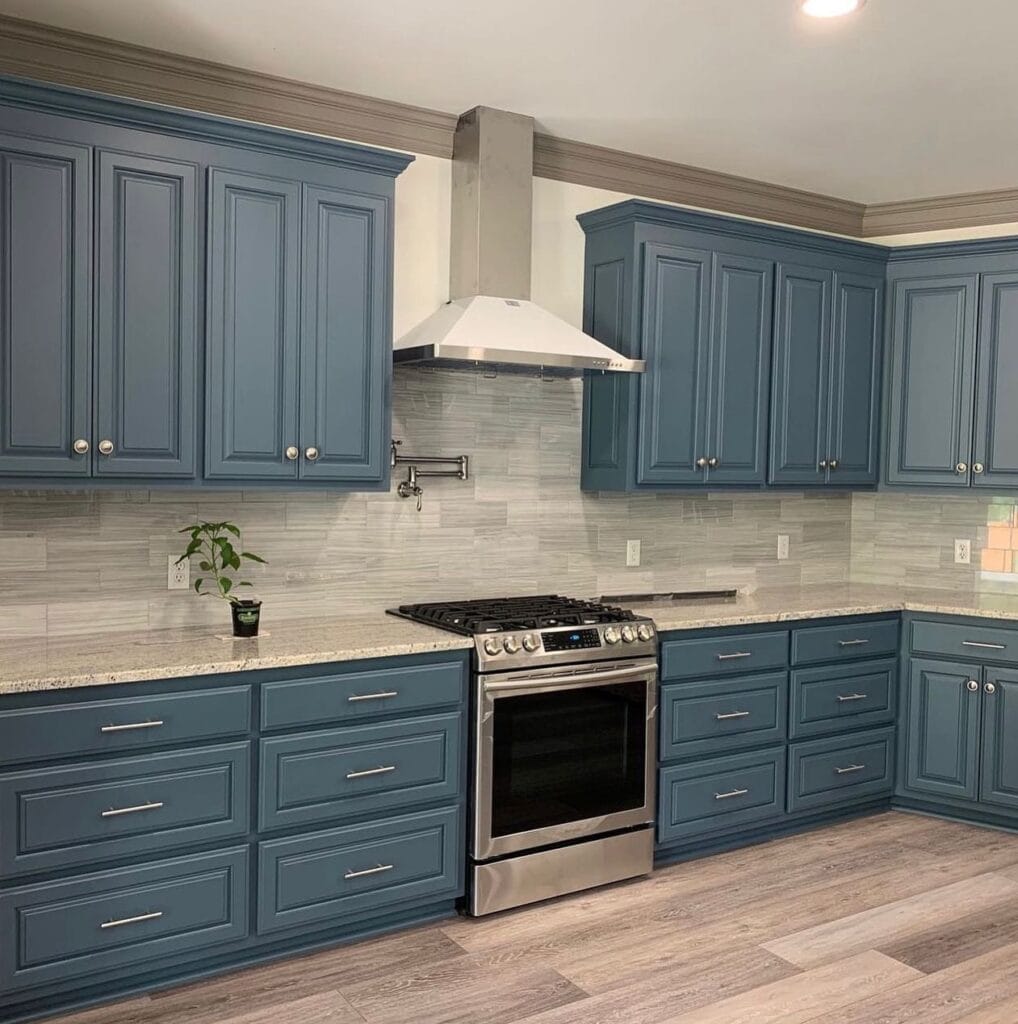
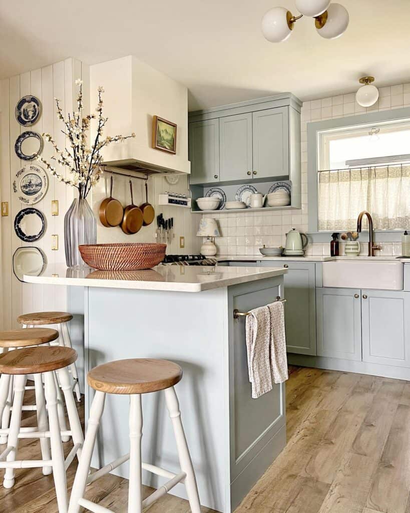
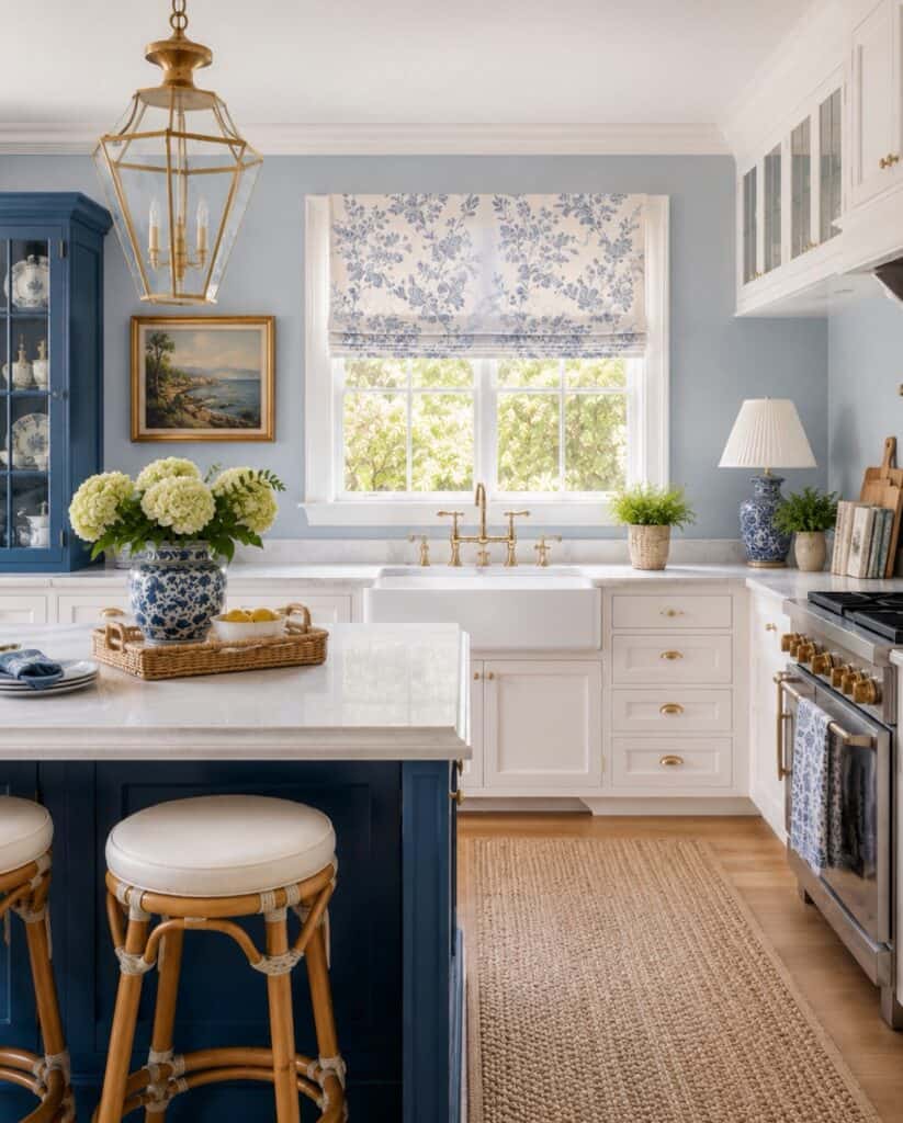
Blue Kitchen Paint Colors
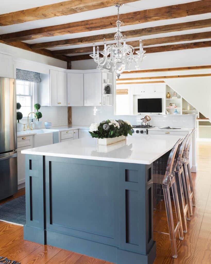
Blue is a classic that never really leaves. Blue kitchen paint colors work especially well on kitchen islands, lower cabinets, pantry doors, or accent cabinetry, where they add depth without overwhelming the room.
Blue pairs beautifully with white, warm wood, brass, black, marble-look counters, and classic subway tile.
Sherwin-Williams Naval SW 6244
A deep, confident navy. Gorgeous on an island or lower cabinets for that timeless, dressed-up look.
Sherwin-Williams Waterloo SW 9141
A denim-like blue with gray and green in it. Softer than navy, with a relaxed, lived-in feel.
Behr Blueprint S470-5
A slate blue with a calm, versatile quality. Lovely on cabinetry or a pantry door when you want color that still feels grounded.
Sherwin-Williams Silver Lake SW 9633
Silver Lake is a soft, airy blue that feels fresh without being too bright or beachy. It’s a lovely option for kitchen walls, trim, a pantry door, or even a lighter kitchen island if you want a gentle touch of color.
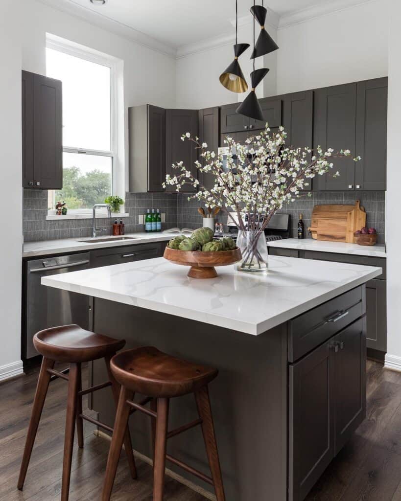
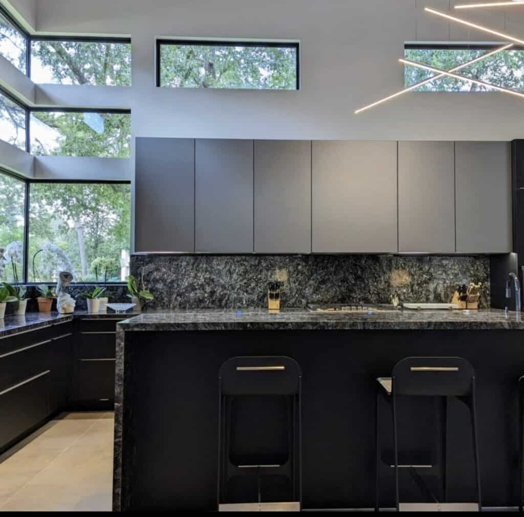
Dark and Moody Kitchen Paint Colors
Dark colors can look absolutely beautiful in a kitchen when they’re used with a little care. Think islands, lower cabinets, modern farmhouse spaces, pantry doors, or a single accent wall. The trick is contrast and light. Give a dark shade something bright to play against so the space feels rich, not heavy.
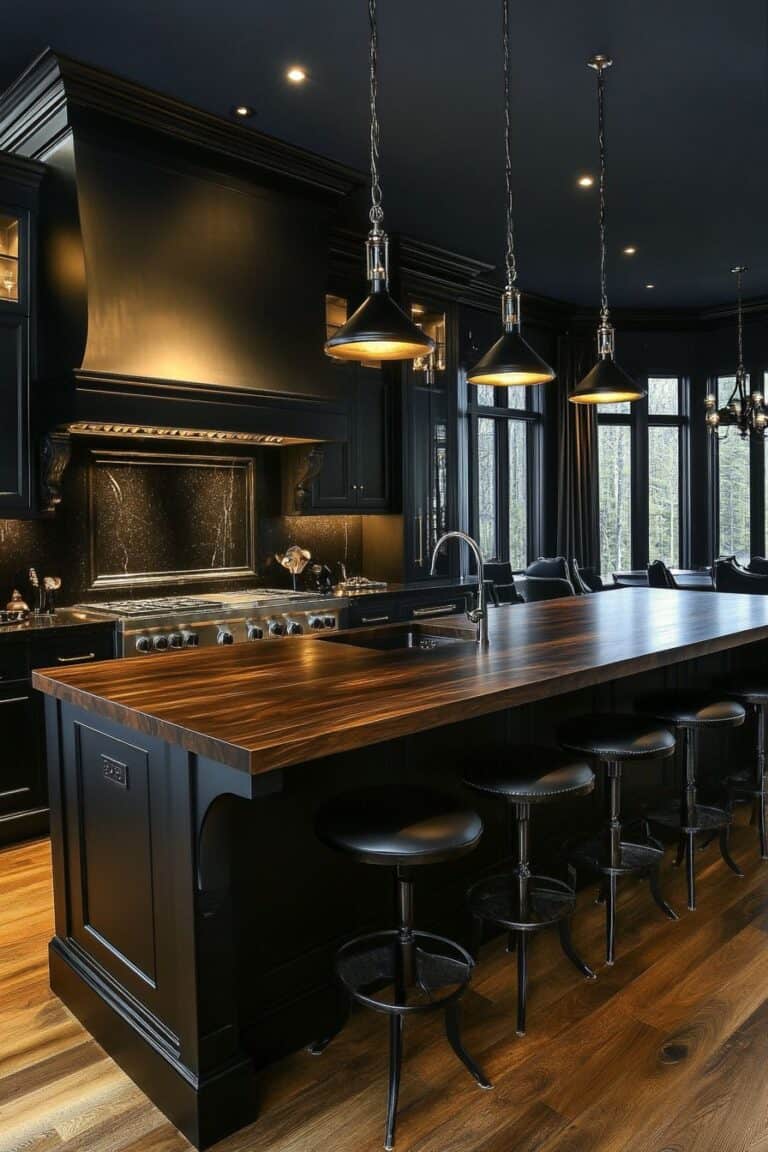
Sherwin-Williams Iron Ore SW 7069
A soft, deep charcoal that reads almost black but stays warm and approachable. Fantastic on islands and lower cabinets.
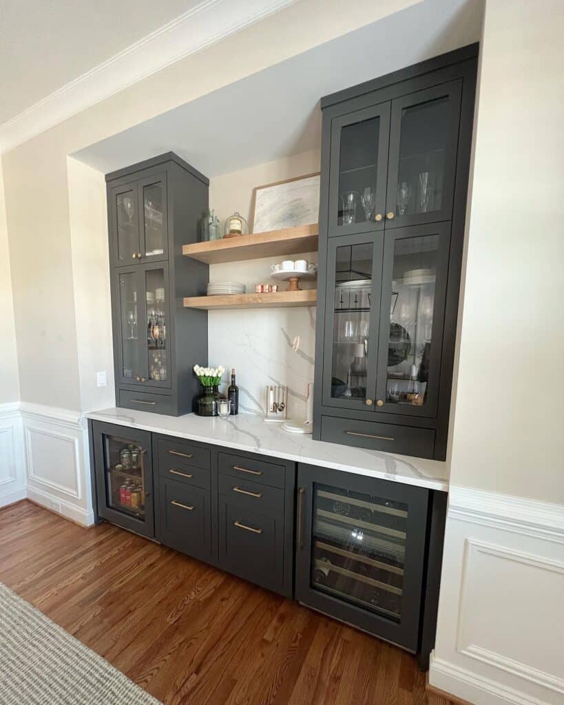
Sherwin-Williams Urbane Bronze SW 7048
A warm, earthy dark brown-gray. It brings cozy depth and looks incredible with wood and brass.
Behr Cracked Pepper PPU18-01. A near-black with a smooth, modern edge. Striking on cabinetry or a pantry door in a modern or modern-farmhouse kitchen.
Just make sure you’ve got enough lighting and light-colored counters, walls, or backsplash to balance the drama.
Best Kitchen Paint Colors by Project
Sometimes you just want a quick answer. Here’s a simple cheat sheet to point you in the right direction. Treat these as starting suggestions, then test in your own space.
| Project | Colors to Try |
|---|---|
| Best for kitchen walls | Agreeable Gray SW 7029, Accessible Beige SW 7036, Sea Salt SW 6204, Blank Canvas DC-003 |
| Best for white cabinets | Pure White SW 7005, Alabaster SW 7008, Swiss Coffee 12 |
| Best for oak cabinets | Accessible Beige SW 7036, Sea Salt SW 6204, Evergreen Fog SW 9130, Breezeway MQ3-21 |
| Best for kitchen islands | Naval SW 6244, Pewter Green SW 6208, Iron Ore SW 7069, Adirondack Blue N480-5 |
| Best for small kitchens | Pure White SW 7005, Alabaster SW 7008, Blank Canvas DC-003 |
| Best for farmhouse kitchens | Swiss Coffee 12, Dried Thyme SW 6186, Sea Salt SW 6204 |
| Best for modern kitchens | Cracked Pepper PPU18-01, Urbane Bronze SW 7048, Pure White SW 7005 |
| Best for warm and cozy kitchens | Accessible Beige SW 7036, Alabaster SW 7008, Dried Thyme SW 6186 |
| Best for a bold cabinet color | Naval SW 6244, Pewter Green SW 6208, Laurel Tree S390-5 |
Kitchen Paint Colors to Try If You Have White Cabinets
White cabinets give you wonderful flexibility, but there’s a catch: your wall color still has to work with the undertone of that white. A crisp, cool white cabinet and a creamy white cabinet want different neighbors.
Soft greens like Sea Salt SW 6204 and Evergreen Fog SW 9130 look fresh and current against white.
Warm whites like Alabaster SW 7008 keep things bright without feeling cold. Warm neutrals like Agreeable Gray SW 7029 add gentle contrast.
And a blue accent, say Naval SW 6244 on the island, brings in classic charm. Sample a few and see which undertone flatters your cabinets best.
Kitchen Paint Colors to Try If You Have Oak or Wood Cabinets
Oak and wood cabinets often have orange or yellow undertones, and colors tend to look best when they soften those tones instead of fighting them. You don’t have to paint your cabinets to love your kitchen. The right wall color can do a lot on its own.
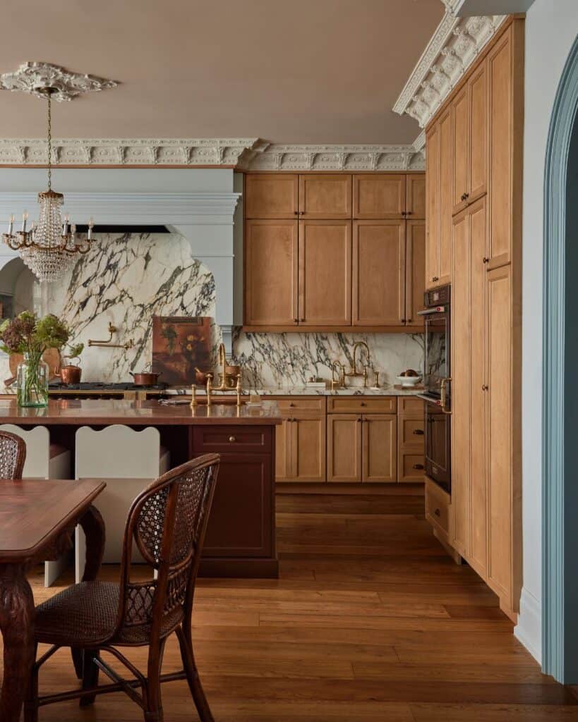
Warm whites like Blank Canvas DC-003 and Swiss Coffee 12 keep the space light and friendly.
Muted greens like Sea Salt SW 6204 and soft blue-greens like Breezeway MQ3-21 balance warm wood beautifully.
And warm neutrals like Accessible Beige SW 7036 make oak feel cozy and intentional rather than dated. Test them right beside your cabinet doors before choosing.
Tips Before Painting Your Kitchen
A little patience here saves a lot of regret later. Before you commit:
- Test large samples. Tiny chips lie. Paint a big swatch, or use a peel-and-stick sample, so you can really see the color.
- Look at it morning, afternoon, and night. Color changes with the light all day long. Live with it for a few days.
- Compare it against everything. Hold the sample next to your cabinets, counters, backsplash, and flooring, not just against a white wall.
- Use the right sheen. Kitchens take a beating, so a washable finish matters. Satin or eggshell often work well on walls, with a more durable finish on cabinets and trim.
- Match the color to its job. Remember whether it’s going on walls, cabinets, or trim, since the same shade can feel very different in each spot.
- Don’t trust online swatches. Screens and lighting distort color. Always confirm with a real sample in your own kitchen.
Wrapping Up
The best kitchen paint color isn’t the one everyone’s raving about online. It’s the one that works with your home’s lighting and your fixed finishes, the cabinets, counters, flooring, and backsplash you’re keeping. Remember that any color can shift depending on light, sample size, and what’s sitting right next to it.
So here’s your simple next step: pick 2 to 4 favorites from this list, grab samples, and test them in your own kitchen before you commit. Your future self will thank you.
Frequently Asked Questions
What is the best paint color for a kitchen?
There’s no single winner, but warm whites like Alabaster SW 7008 and soft neutrals like Agreeable Gray SW 7029 are safe, flexible favorites. The best choice is always the one that works with your specific lighting and finishes.
What kitchen paint colors are timeless?
Warm whites, soft greens like Sea Salt SW 6204, classic navies like Naval SW 6244, and warm neutrals like Accessible Beige SW 7036 tend to feel timeless rather than trendy.
What paint colors look good with white kitchen cabinets?
Soft greens, warm whites, warm neutrals, and blue accents all pair beautifully. Try Evergreen Fog SW 9130 on walls or Naval SW 6244 on an island. Just match the wall color to your cabinet’s undertone.
What paint colors look good with oak cabinets?
Colors that soften orange and yellow undertones work best. Think warm whites like Swiss Coffee 12, muted greens, soft blue-greens like Breezeway MQ3-21, and warm neutrals like Accessible Beige SW 7036.
Are green kitchen cabinets still in style?
Yes. Soft and deeper greens like Evergreen Fog SW 9130 and Pewter Green SW 6208 feel classic and earthy, not fleeting. They read timeless when paired with wood and brass.
Should kitchen cabinets be satin or semi-gloss?
Both work, and it comes down to preference. Satin gives a softer, more modern look, while semi-gloss is slightly more durable and easier to wipe down. Test a sample to see which finish you like living with.